Setups: Profile managerIn the profile manager, you create forms for your website that subscribers can use to change their subscriber data themselves, for example when their email address changes. The subscriber can also add missing information, for example areas of interest. You insert the profile manager link via the input assistance, either directly in the newsletter or on a landing page. A typical process looks like this: the subscriber clicks 'Change profile' in the newsletter. A form opens in which the existing subscriber data is prefilled. The subscriber changes or adds their data and saves the entry. |
|||
 |
|||
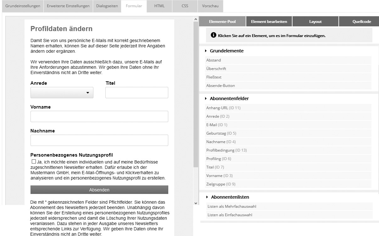
Creating a new profile manager setupBasic settingsEnter a name and, optionally, a description. Advanced settingsIn the 'E-mail forwarding' field, enter your own email address if you want to receive a notification email for every profile change. This email contains the subscriber's data before and after the change. The 'Report changed fields only' option lets you decide whether all fields or only changed fields are listed. An 'HTTP forwarding' is also possible to forward the data to a URL on your own server. The POST method is used for this. The data format is field[<fieldid>]=<fieldvalue>, list[<listid>]=<0 or 1>, id=<subscriberid>. Dialog pagesHere you enter the URLs of your own dialog pages. If these fields are left empty, the system's default dialog pages are used. FormOn the 'Form' tab, you design your profile manager form. The view consists of two areas: on the left you see the preview, on the right all available elements and editing options.
Every change is immediately visible in the preview. The three basic steps are:
The right side shows 4 tabs for editing the form: Tab #1: Element pool Here you find all elements that can be inserted into the form. To place elements side by side instead of one below the other, simply change their width, e.g. from 100% to 50%.
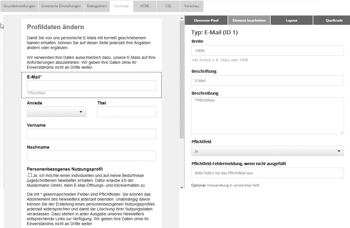
When you select an element in the preview, the 'Edit element' tab opens on the right. The following screenshot shows this using the example of the 'Email' field:
Subscriber fields have the following properties:
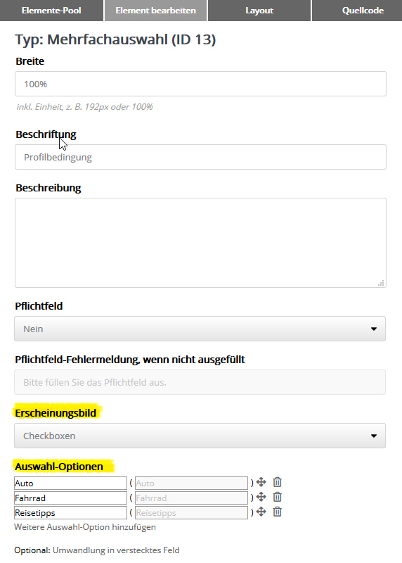
The checkbox for consent to the 'Collection of personal data (user profiles)' should be included in the form, so that subscribers can activate or deactivate it at any time, independently of receiving the newsletter. The field types Single selection or Multiple selection (e.g. the salutation with the options Mr/Ms) have additional settings for 'Appearance' and 'Selection options'. The same applies to the selection element Subscriber lists:
For the Appearance, select either 'List selection' or 'Checkboxes' (single selection) or 'Radio buttons' (multiple selection). In the 'Selection options' area, you define whether all or only certain field options (or lists or setups) are offered in the form. Use the icons on the far right to change the order of the options via drag&drop or to hide options. In the left column of the table, you adjust the name with which each option should appear in the selection list. On the right side, you see the original name (value) of the field option for information (cannot be changed). For a list or setup selection, the ID is displayed. Use the 'Add selection option' link to add previously hidden or newly added options to the selection at any time.
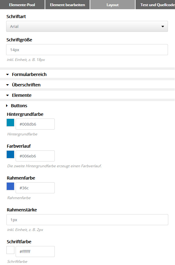
Tab #3: Layout Here you define the general look of your form, such as font, colors and inner/outer spacing. Every change is immediately visible in the preview.
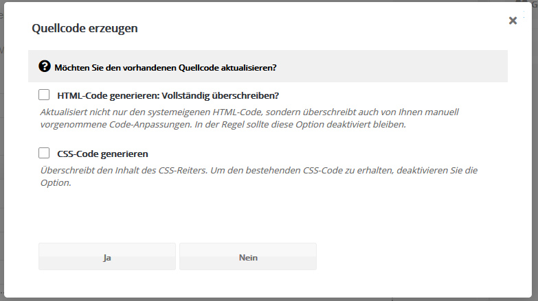
Tab #4: Source code Once you have put together your form, you generate the current form source code here. There is an important difference between profile manager forms and opt-in/opt-out forms:
To test the source code, insert the profile manager link into a mailing via the input assistance. Send yourself a test delivery of the mailing and click the profile manager link in it. Test the behavior of the form: Are changed profile data saved to the subscriber fields? Is the error message for required fields that are not filled in helpful? Are the correct dialog emails sent? Do the dialog pages you set up appear? 'HTML' and 'CSS' tabsThese tabs show the automatically generated form source code, which you can adjust if needed. Adding your own adjustments to the source codeIn the new code format (since February 2017), you can also add your own adjustments to the source code generated by the system if needed. This applies to HTML, JavaScript and CSS. The following areas of the 'HTML' tab are always overwritten by the system, so please enter your own adjustments outside these areas:
|