Administration: Account white labeling
With our White Label Editor, you can adapt the layout of your account to your corporate design in just a few clicks. No HTML or CSS knowledge is required.
For multi-account systems and single accounts
If white labeling is activated in the admin account of a multi-account system, it automatically applies to the accounts below it. Independently of this, you can order individual white labeling for each subaccount.
Only users with the activated role permission Permissions administration -> Account white labeling have access to the White Label Editor.
White Label Editor
Open the White Label Editor in the menu Administration -> Account white labeling.
On the left, on the Basic settings tab, select one of the preset color schemes. To the right, the Preview immediately shows you the result. On the Color settings tab, you can adapt the preset color scheme individually to your corporate design.
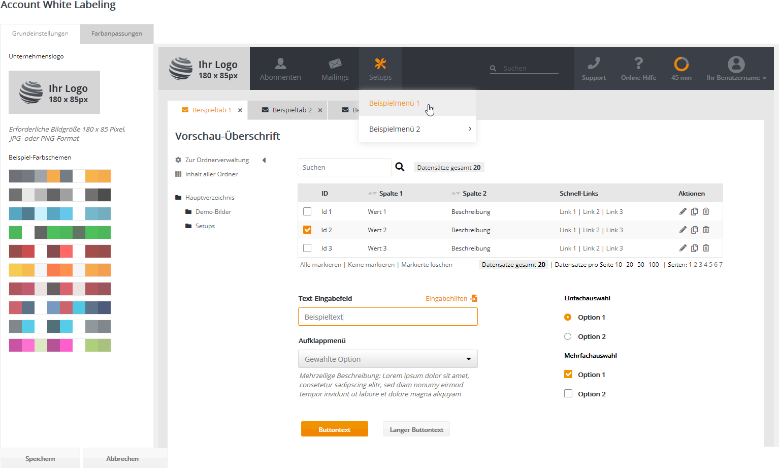
The controls in the preview serve as a visual example and do not perform any function. You can safely test the visual effect of different settings. The settings are only applied to your account when you click Save.
Basic settings
Start customizing your account with these two settings:
- Logo: Click the sample image to upload your company logo. The logo is a fixed part of your navigation menu. By clicking the logo, your users can return to the account's dashboard at any time. The image must be 180 x 85 pixels in size and in JPG or PNG format.
If your account already used white labeling before the facelift, you will find the additional link 'Download previous logo' below the logo. Please adapt your previous logo to the new size. Then select it as your new logo. - Example color schemes: Click one of the color schemes to test its effect in the preview. You can now save these colors or adapt them individually, as described in the next section.
Color settings
Here you can adapt 11 individual colors to your corporate design.
|
|
Click the color field to choose the desired Colors 1 to 4 apply to the navigation menu. |

Colors 1 ... 4: Navigation menu
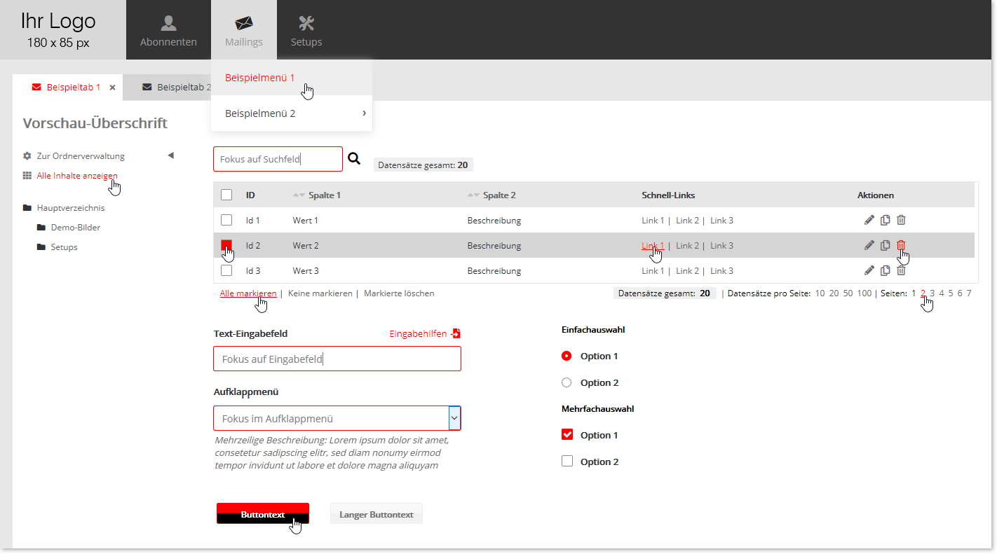
In the following screenshots, the red color shows the individual effect of the setting described.
Color 1: Background of the main menu

Color 2: Focus background of the main menu, also the default background of the right-hand menu
When the mouse pointer touches a main menu item (focus or mouseover), color 2 is used. The same color is the default color of the right-hand menu.

Color 3: Foreground for text and icons, and color of the session timer (elapsed time)

Color 4: Focus foreground for icons, and 2nd color of the session timer (remaining time)

Colors 5 ... 7: Page content
Page heading: Text color of the page heading

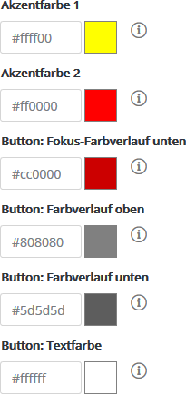
Accent color 1: Selection mark in single and multiple selections, and focus color of the button text

Accent color 2: Focus color for text, checkboxes, input fields, tabs and buttons (color gradient top)
Button colors
For the buttons, you can choose 3 default colors and 3 focus colors. Each consists of a two-color background and the text color.
|
|
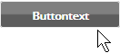
When the mouse pointer touches the button, the accent colors 1 and 2 described above apply, together with the color Button: Focus color gradient bottom.
Otherwise, the three default colors Color gradient top + Color gradient bottom + Text color apply.
|